

Words are an important part of our lives. We use them on a daily basis. We type them on computers, write them on paper, and speak them to each other. With all this being said, we can assume that words are also important in advertising. It’s almost important how you present these words. Here we are going to breakdown the basics of typography, and how to use it.
Typography is a term that refers to the style, arrangement, or appearance of typeset. It is the font, the bolds, the italics, the size of the text, and the layout you choose.
Readability is the most important part of any print or web media. And choosing the right background, the right font, and the right font color are all vital to this. Avoid textured or busy backgrounds. These are both distracting and make the text hard to read. Keep the contrast between the background and text high, as the more contrast there is, the easier it is to read. Also, keep good spacing on your page, don’t bunch up your text as it makes it harder and more frustrating to read. Too small of text can be frustrating for readers and may end up driving people away from your copy. Finally, use contrast throughout your page. The contrast between colors, but also contrast between sizes and images on the page. Larger text is a good way to direct attention to certain topics of the page.
Font
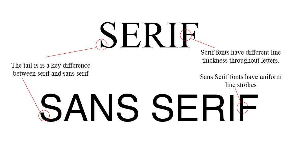
Choosing the right font is an important decision to make. There are two different types of fonts. Serif and sans serif. Serif fonts have little tails on the letters, and stroke lengths change through letters. An example of serif fonts is Times New Roman.
Sans Serif, or “without” serifs, fonts do not have the tails on letters, and stroke lengths are consistent throughout the letters. An example of sans serif is Arial.
Serif fonts are considered by consumers to be more traditional. They represent the structure and a sense of establishment. Sans serif fonts, however, represent more modern sensibilities. They represent a more casual setting.
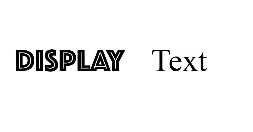
Display vs Text
The next two distinctions between fonts are the differences between display and text fonts
Display fonts are meant to draw attention to themselves. They’re bold and guide the eye across the advertisement. They might be stylized, they might not be, but most are not supposed to be read for more than a few words. Think about any Coca-Cola ad you’ve ever seen. The Coca-Cola logo is iconic, whenever you see that cursive you think of coke. Whenever you think about coke you see that cursive.
Text fonts are the opposite of display fonts. This font is used for continuous reading, it’s simple and easy on the eyes. We see it so much that we take it from granted. We see text fonts in newspapers, magazines, books, webpages, even this blog. It goes unnoticed because it’s simple, easy on the eyes, and your eyes move easily across the page from word to word.
Finding the right balance between display fonts and text fonts is crucial for any ad, webpage, or piece of media. If you overuse display fonts, you run the risk of annoying the reader and pushing them away from your ad. If you underuse the display font, then you run the risk of people never reading the ad in the first place. Too much copy and people will get bored and move on. Too little copy and people might not know what you’re selling.
Conclusion
Typography is an important part of any design. There are a lot of fonts out there, and a lot of choices that aren’t easy to make. Hopefully, this blog has given you some more information on this vast sea of choices. Whether you go with serif text, sans serif, or plaster your company in the flashiest display font you can find. Any questions about typography? Or want to get into touch about getting the design just right? Contact us here.