6 Steps for the Best Small Business Web Design

Small Business Web Design

Is your small business online? You may already be aware of the importance of social media for your business, but is your website optimized for maximum lead conversion? And do you know the best small business web design and user experience (UX) strategies to make your site beautiful and user-friendly?

In 2022, design is king for your website. In fact, a survey found that 50% of consumers believe that website design is important to a company’s brand. But user interface (UI) or UX is also incredibly important. UX/UI involves how users interact with your website, and how easy or difficult it is to navigate. In the same survey referenced above, 42% of users reported that they would leave a website because of poor functionality.

So, for the best possible client experience, you want your small business website to be responsive, elegant, and easy to navigate. But how do you go about this? Where do you start with small business web design?

Designing a small business website is a time-intensive endeavor, and there are many factors that affect web design or UX choices. However, there are some general rules of thumb to keep in mind. Keep reading for our top small business web design strategies to improve your small business website.

Step One: Set Up Your Site

You may already have a website for your small business, but if you don’t, you’ll need to start from the ground up. First, choose a Content Management System, or CMS, to develop your site. There are many CMS on the market to choose from, but the easiest are platforms that have a simple front-end design experience. Font-end design experiences, included in CMS like WordPress and Squarespace, allow you to visually design your website without needing extensive coding knowledge.

After you’ve chosen your CMS, you will need to choose a host and domain for your site. A web host is where your website files are stored, and many hosting platforms will cater to a particular CMS. For example, Bluehost markets itself as a WordPress hosting site. WordPress itself also offers hosting services with WP engine.

A domain is the web address that a user types in to find your website. Domain names should be simple, short, and relate to your business. If possible, use a keyword in your domain name that would be searched to find your business. For example, if your name is Hannah and you own a shoe store, you could register the domain “hannahshoes.com”. Robert with a consulting firm could register a domain like “robertsconsulting.com”.

Step Two: Choose Your Site’s Purpose

Next, you need to know the purpose of your small business website. Will you be selling products online? Or is your site geared toward generating leads for a service you provide? Do you own a restaurant and your patrons are looking for your menu? Or are you a content creator, and you want to display your work for future clients? The purpose of your website will largely determine the layout and types of pages, as well as the overall branding and design. We’ll go more into detail in the section about pages.

Step Three: Decide on Design and Layout

Now that you have your CMS, domain, hosting, and the purpose of your small business website, it’s time to start designing. You can design your website using a template or create your own from scratch. Either way, first you will need to choose the overall look and feel of your website. What colors and typefaces are you using? Are you using images as design elements, or sticking to a more text-based design? Whatever you choose, keep it simple and stick to a defined color palette, typeface, and header style on every page. The more consistent your design, the more visually appealing your site is to your visitors.

Next, choose a layout for your information. How is your content organized? Most users will expect these common elements, so make sure you include them in your layout:

  • A header with a navigation bar.
  • Your logo or business name.
  • Contact information that is easily accessible.
  • Footer navigation.
  • Social media links.

Many websites now have a one-page, scrolling design, where the tabbed pages in your navigation bar transition from one to the next simply by scrolling. This layout is popular due to the increased prevalence of mobile internet traffic, where scrolling rather than clicking is the preferred method of consuming content. Choose the design that’s best for your small business website and your customer experience.

Step Four: Choose Your Pages and Create Content

With a design and layout in mind, it’s time to create your pages and fill them with content. Depending on the kind of small business you’re operating, you will want to emphasize different pages further up in your hierarchy. Restaurants will want their menu page front and center, while companies that provide services will need to list and describe those services first. Your pages will vary, but make sure you at very least include the following:

  • About Page
  • Services Page or Pages
  • Contact Page
  • Privacy Policy Page (A Legal Requirement)
  • Terms and Conditions Page (Also Required)

Next, you’ll need to fill your pages with content. Make sure to have enough information on each page, but not too much to prevent visual clutter. Present information in an easy-to-read format, such as lists or bullet points, with clearly defined headers so visitors can find what they’re looking for more easily. Most web users skim read to find what they want to know, so utilizing headers is a great way to make sure your important content isn’t lost in excess fluff.

Step Five: Optimize for SEO

Once you create your content and organize your site layout, you will need to optimize your small business website for Search Engine Optimization (SEO). Ensure that your small business website follows SEO best practices, including organic use of keywords, appropriate alt text for images, and updating meta descriptions within your search engine optimization tools. These SEO strategies will ensure your site ranks positively within search engines, increasing the chances of your target audience finding your website. You can check out this guide for some SEO best practices you can use to increase your small business website’s search engine rank.

Step Six: Optimize for Mobile Devices

To build off of the last point, SEO and mobile optimization go hand in hand, as Google has recently switched to mobile-first indexing. Users also respond more positively to sites that are optimized for mobile. So, making sure your website is fully optimized for all devices is key to gaining and retaining lead conversions.

Approximately 55% of all web traffic comes from mobile devices, and 93% of users surveyed report that they would leave a website if it wasn’t optimized for their device. Utilize the responsive design settings in your CMS to design for desktop, tablet, and mobile devices, so your small business website works smoothly and looks sleek across all devices. Images and text elements should be resized to fit the screen, and navigation menus should be compressed into a hamburger menu, so the navigation is mobile-friendly.

Get a Killer Small Business Web Design from Killerspots

Are you not sure where to start designing your small business website? Killerspots’ web design team creates beautiful, responsive websites for our clients, no matter what industry they’re in. Learn more about our web design services and get in touch with us to get started today.

The Benefit of Strong Logo Design for Your Brand

Logo design

A killer logo is critical to the success of your brand and organization. After all, you want your brand to be clear, recognizable, and persuasive so you can attract clients and build your business. Pulling together the right design elements into a logo can elevate your brand — and your sales.

Curious to learn more? Keep reading to understand why you need to prioritize logo design when building your brand!

Strong Logo Design Makes a Strong First Impression

First impressions are everything, right? And you want to make the best one possible when you’re establishing a brand. That’s where a dynamic logo can set you apart from the crowd.

With a logo, you need a design that plays into your consumers’ expectations for your brand. Think about what kind of tone you want to communicate. What colors, shapes, and icons can come together into a fresh and appealing logo?

By having a strong logo, you’ll make the right impression on potential customers. People have busy schedules and a lot of interests competing for their attention, so you need to hook them right away. They’ll be more likely to check out what you have to offer within your brand if they are wowed from the start.

How do you make that first impression? You hire experienced designers who can listen to your expectations and craft the perfect business logo design.

Hiring the right design team is a big piece of the branding puzzle since you need designers who can capture your brand with well-chosen design elements and a little originality. Work with your graphic designer to help them understand the mission of your organization so that you can make that strong first impression.

The Right Shapes Can Work Wonders

Recent studies suggest that the shape of a logo impacts the way a customer understands an organization. What does that mean? It means that when it comes to graphic design for logos, you’ll need to choose your shapes wisely.

Think about how you want your audience to perceive your brand. Do you want them to see you as friendly and service-oriented, or efficient and commanding? Do the research to know who your target audience is, and find ways to incorporate the visual qualities best suited to that audience.

It’s also important to determine what visual qualities work best. These will depend on your goals. An experienced graphic designer can choose the right tools for the job, and then walk you through the design theory behind their choices.

When it comes to shapes, curves and rounded lines tend to create a sense of warmth and approachability. So if your brand serves people in a very direct way, curves can be a wise choice within your brand identity.

Sharper lines and edges suggest professionalism as well as brand strength. A simple, more sever design might communicate that your brand is forward-thinking and cutting edge. Keep the corners sharp and the details minimal.

If you and your designer do opt for text, talk it over with them. Make sure you’re clear on the visual difference between serif and sans-serif fonts. They project very different images, so know which one serves your brand identity better!

You’ll Communicate Your Brand Clearly

Your brand logo needs to communicate your product or service clearly. If it doesn’t, you risk losing potential customers to your competitors.

If you’re real estate agent, for instance, it makes sense that your logo would communicate a sense of orderliness and structure — or maybe even an image of a house. With logo design, the goal is for someone who hasn’t seen your mission statement or anything else to be able to have some sense of what your brand represents.

A good rule of thumb is to show your logo design to other people for feedback. These can be friends, family, coworkers, or strangers. A good designer will be open to feedback and work with you to make sure that you’re satisfied.

Logos Make You Instantly Recognizable

You want a logo that people will recognize in any context. This is a challenging goal to achieve, but it is possible through excellent design work. And excellent design work means that even a simple shape or abstraction can speak volumes about who you are and what you do.

In today’s competitive world, consumers have grown distrustful of advertising that says too much. Advertisements that make false claims or seems too good to be true actually can damage a brand. This means that heavy-handed, text-heavy logos are falling out of favor.

Clean and comfortable logos are the better way to go. Brands like Nike have stayed relevant in part because of their memorable designs. Everyone knows the Swoosh, and there’s nothing aggressive about it.

Paying for a logo design might seem like a big upfront investment, but it’s one that pays off in the long run. And don’t think you can design something on your own if you don’t have a design background. It’s better to hire the right designer so that your logo looks professional and not amateurish!

When you’re developing your brand logo design, aim to create something that people will recognize whether it’s on a poster, website, or article of clothing. Brand recognition is huge, and you don’t want your brand to get lost in the shuffle.

Logos Help With Social Media Marketing

It’s important to leverage social media to showcase your brand, too. The days of relying on print materials are gone, so upping your digital game is crucial to your brand’s success. Set up social media accounts and use your brand as your profile picture whenever possible.

So much of social media is visual, so logos offer an easy way to engage new clients. With the average person spending over 5 hours on their phones each day, people are encountering so much visual content — and at a rapid speed. Make sure that your brand logo is active on a number of social media platforms as part of your marketing strategy.

Assign your savviest employee to handle the responsibilities, and make sure to document the metrics so you can see how your audience responds to your logo. If you notice that your logo is not translating into an audience or new sales, look into making some revisions.

You’ll Build Visual Consistency

From a branding standpoint, nothing is worse than an inconsistent public image. If the text and colors on print materials differ from those on Instagram, you’ll confuse your audience. And if the text is serif in one place and sans-serif in another, you won’t be building brand consistency.

With a logo, you create a clean symbol that you can include in any branding materials, whether digital or print. Think of it as a stamp or seal. Everything else you write or design should complement and enhance your logo.

And make sure that your logo works well in black and white. While most digital platforms will allow you to use color, be prepared for other formats — like print media — where you may be limited to grayscale. Design a logo that has enough contrast and clarity to translate to black and white formats effectively.

Ultimately, consistency is the key. Since part of your goal is to draw in new customers, keeping your logo uniform and clear is an essential step to creating a strong brand. Your brand will be more memorable and easier to recognize in a crowded field of competitors.

You’ll Build Brand Loyalty

You want your customers to come back, right? If customers have a good experience with your product or service, they’re more likely to do that. That’s why you want them to make a strong visual association with your brand — and a logo can help you do that!

Aim for a design that is timeless and not gimmicky. Designs that are based on trends will feel stale quickly. Things like drop-shadows, gradients, and handwritten text might seem like fun design choices at the moment, but you might be sick of these trends a year from now.

If your design has staying power, your clients may be more interested in sticking around, too. A logo that changes frequently could suggest that your brand is unreliable.

The Bottom Line

Good logo design has the capacity to elevate your organization’s visibility and sales. With some research and collaboration, you can build a brand that people will know and want to come back to. Make sure logo design is the next thing you pursue to strengthen your brand.

When you’re ready to craft the perfect logo, contact us and we can work with you to realize your vision!

The Basics of Typography

typography

Words are an important part of our lives. We use them on a daily basis. We type them on computers, write them on paper, and speak them to each other. With all this being said, we can assume that words are also important in advertising. It’s almost important how you present these words. Here we are going to breakdown the basics of typography, and how to use it.

Typography is a term that refers to the style, arrangement, or appearance of typeset. It is the font, the bolds, the italics, the size of the text, and the layout you choose.

Readability is the most important part of any print or web media. And choosing the right background, the right font, and the right font color are all vital to this. Avoid textured or busy backgrounds. These are both distracting and make the text hard to read. Keep the contrast between the background and text high, as the more contrast there is, the easier it is to read. Also, keep good spacing on your page, don’t bunch up your text as it makes it harder and more frustrating to read. Too small of text can be frustrating for readers and may end up driving people away from your copy. Finally, use contrast throughout your page. The contrast between colors, but also contrast between sizes and images on the page. Larger text is a good way to direct attention to certain topics of the page.

Font

Choosing the right font is an important decision to make. There are two different types of fonts. Serif and sans serif. Serif fonts have little tails on the letters, and stroke lengths change through letters. An example of serif fonts is Times New Roman.

Sans Serif, or “without” serifs, fonts do not have the tails on letters, and stroke lengths are consistent throughout the letters. An example of sans serif is Arial.

Serif fonts are considered by consumers to be more traditional. They represent the structure and a sense of establishment. Sans serif fonts, however, represent more modern sensibilities. They represent a more casual setting.

Differences between Serif and Sans Serif font
Display vs Text

The next two distinctions between fonts are the differences between display and text fonts

Display fonts are meant to draw attention to themselves. They’re bold and guide the eye across the advertisement. They might be stylized, they might not be, but most are not supposed to be read for more than a few words. Think about any Coca-Cola ad you’ve ever seen. The Coca-Cola logo is iconic, whenever you see that cursive you think of coke. Whenever you think about coke you see that cursive.

Text fonts are the opposite of display fonts. This font is used for continuous reading, it’s simple and easy on the eyes. We see it so much that we take it from granted. We see text fonts in newspapers, magazines, books, webpages, even this blog. It goes unnoticed because it’s simple, easy on the eyes, and your eyes move easily across the page from word to word.

Finding the right balance between display fonts and text fonts is crucial for any ad, webpage, or piece of media. If you overuse display fonts, you run the risk of annoying the reader and pushing them away from your ad. If you underuse the display font, then you run the risk of people never reading the ad in the first place. Too much copy and people will get bored and move on. Too little copy and people might not know what you’re selling.

Differences between Display and Text Font


Conclusion

Typography is an important part of any design. There are a lot of fonts out there, and a lot of choices that aren’t easy to make. Hopefully, this blog has given you some more information on this vast sea of choices. Whether you go with serif text, sans serif, or plaster your company in the flashiest display font you can find. Any questions about typography? Or want to get into touch about getting the design just right? Contact us here.

The Basics of Color Theory in Design

Blue and teal color splash

The Basics of Color Theory in Design

Color is the first thing we perceive. If something moves past you in a blur, it’s not the shape that leaves an impact, it’s the color of the object. As such, color is a cornerstone from which you should build any logo, branding, or design. Colors can leave lasting impacts and memories for consumers, and can even be associated with products or companies on color alone. When you think of McDonald’s, you think of the golden arches. When you see a red can of soda, you think Coke, just as you think Pepsi when you see blue. Color is an important part of perception and making sure the colors you choose are aesthetically pleasing to the eye is just as important. This post will show you some of the fundamentals of color theory, how to use these theories, and practical applications.

The Color Wheel

Like any concept, the best place to start is at the very beginning. For the color theory that would be the color wheel.

The color wheel is an illustrative guide of color hues around a circle. There are twelve hues, or pure colors, that make up this wheel, separated into three different categories: Primary colors, secondary colors, and tertiary colors. The primary colors are Red, Yellow and Blue. These three colors form the basis of all other colors. Secondary colors are green, orange, and purple, and are made when you add one primary color to another primary color, creating a new color. For example, red + yellow is orange, Red + Blue is purple, and blue + yellow is green. Tertiary colors are the six colors you get when a secondary color is added to a primary color. There are six of these colors, creatively named red-orange, red-purple, etc.

The color wheel can be broken down further into two different categories, warm colors and cool colors. Warm colors are your reds, yellows, and oranges. These colors evoke feelings of happiness, comfort, and energy. Cool colors are your greens, blues, and purples. These colors promote such feelings of calm and tranquility, harmony and nature. They can also invoke feelings of sadness and depression, so a balance between cool and warm colors should be carefully considered when making any design.

Color Theory Schemes

Since we’ve mastered the color wheel, it’s time to look at the basics of color theory and design; color schemes. An important item to consider when designing should be that it is aesthetically pleasing. This can be done by using color schemes. Color schemes are choices in a color that create a uniform style and appeal.

Here is a rundown on a few of the most prevalent schemes you’ll see:

Complimentary Colors:

Here the colors are sitting directly across from each other on the color wheel: such as Red-green, Blue-orange, yellow-purple.

This scheme really makes images pop because of the contrast between the colors emphasizing each other. Be wary of overuse, though, as this scheme can be harsh and exhausting after extended use. Think of all the red and green you’re sick of by the end of the Christmas season.

Split-Complimentary Colors:

color theory

This is similar to complementary colors, this takes colors directly opposite of each other on the color wheel. This is different, however since they use the two colors directly adjacent to the complimentary color. Think yellow with red-purple and blue-purple. Since the colors are not directly complimentary the contrast is not as harsh, meaning it is softer on the eye, but still does a good job of accenting the colors.

Analogous and Accented Analogous Colors:

color theory

Analogous colors are three colors that are all directly next to each other on the color wheel. This scheme is best used with one color being the primary focus with a second that supports it and the third to accent the other two. This scheme gives a pleasing aesthetic that is uniform and can be used to direct attention and action on a website for example.

color theory

Accented is the same as analogous colors, using three directly next to each other, but here you add the complementary color of the primary hue of the three to accent and add contrast to the theme.

Triadic and Tetradic Colors:

Triadic are three colors that are evenly spread around the color wheel from each other. These colors do a good job of creating contrast and tend to be very dynamic and bright. But these three colors also do a good job generating harmony together.

color theory

Tetradic is four colors, two sets of complementary colors that are evenly spaced around the color wheel forming a rectangle. Here you want to be careful of the balance between warm and cool colors to avoid clashing.

Emotion

Color theory can also be used to evoke certain emotions. Much like how cool and warm colors have certain feelings associated with them. Check out this handy guide on what emotions certain colors can evoke.

Application

After designing your logo, you now have to get that logo out there and make sure that the colors you painstakingly picked are replicated on all the platforms you use. This is important since printing on the surface, producing on TV or the internet and mixing paint on a canvas can all change the perception of the colors of your logos.

So far, we have talked about the RYB color wheel, which is how we perceive color in the world. But how does a computer replicate that color through ones and zeroes, or a printer match that color without having 600 cartages of ink on hand? They do this through two different color models, the RGB (Red Green Blue) and the CYMK (Cyan, Magenta, Yellow, Key [black]) models respectively.

RBG Model

The RGB model is an additive color mixing model. It uses three colors to create more colors by mixing light waves together, these lights being red, green and blue. If you have ever seen a pixel of a TV or a computer monitor then you’ve seen the three lights. Computers can make new colors by changing the intensity of the different colored lights, mixing them together and making new colors. This works on the that the way we perceive color in nature is the reflection of light waves off of objects. This model instead projects those light waves onto our eyes, making similar colors.

CMYK Model

color theory

The CMYK model is essentially the opposite of the RGB model and is the most widely used model in color printing. Instead of projecting the light onto our eyes, this model relies on the reflection off of the paint or ink. This model is a subtractive one, instead of an additive one, much like the RYB model. The colors absorb certain wavelengths of light, meaning the color reflected from the surface is without that wavelength and thus without that color. Cyan, for example, does a good job of subtracting red light, so thus the reflected color is blue and green mixed together. CMYK is a similar model to RYB, but the cyan, magenta, yellow and key (black) of this model offers a wider array of printing color.

These models do a good job of replicating colors, but they are both different, so alterations are possible. Colors will not appear exactly the same even within the same model. Sometimes changing based on the manufacturer or even the age of some screens or ink. To have a consistent design across all platforms, you must be cognizant of all of these differences and prepare accordingly.

Conclusion on Color Theory

Understanding the basics of color theory can go a long way when designing anything. Knowing how colors work, how they interact with each other, and how to apply those designs can leave an impact on all who see it. Color theory is a fundamental part of life and thus should be a fundamental part of any design, logo or brand.

Have any questions about color theory or design? Contact us here. 

A Great Process Equals A Great Design

process

Great Process. Great Design.

Having a great process when designing is important to produce great work. You will have a smoother path from the beginning to the end. Everybody’s process is different, but there are some key points that you should remember: Research, brainstorm, creating a mood board, sketch, putting your design ideas into the computer, and refine.

Research

Researching before you jump into your design is important because it will provide you with an arsenal of inspiration and information to pull from for your designs. The more inspiration you have to pull from, the better. Your research process could be gathering images or written information. Putting together a visual library will help you get started. Some good places to look are designspiration.net and Pinterest. Designspiration.net has a wealth of images and designs from professionals to students of design in almost any subject you are looking for. Pinterest is great for keeping track of what is trending. Even using Google to find images works just as well. This is for you to help you in your process. You might learn something in your research and it may help you in another project or design in the future.

Brainstorm

This is when you take all the information you’ve gathered. You can make word webs or lists of keywords to get some general ideas out. This can help you think outside the box. See where your word web will take you. Brainstorming should be done quickly. Don’t dwell on something for so long and talk yourself out of an idea. At this point, no idea is a bad idea and you’re going more for quantity than quality. If you find yourself hitting a block go for a walk or take a break and clear your mind. Don’t feel pressured at this stage. After you’ve finished your idea generation talk it over with someone and see if they have any additional ideas to add to what you already have.

Mood Boards

Mood boards are helpful in that you can create a visual feeling and make sure you are on the same page as the person you are designing for. A mood board is a collection of images and typography to establish a feeling for your design. It can be structured into a grid or expressive. These boards can be made by hand using found materials or made digitally. Whatever way works best for you. There is no wrong way to put together a mood board if it is conveying a mood. You can reference your mood board throughout your process to make sure you are keeping on track. Making more than one with different moods can help you narrow down what direction you would like to go in.

Sketching

Sketching is important in design. This is a visual way to get your ideas out. At this point, it’s helpful to get out the good, the bad, and the okay at best. I find that if I can get my cliché ideas out of the way first I can move on to more creative ones. Just like with brainstorming you are going for rapid ideation and quantity over quality. You’ll worry about quality later in the process. I also prefer to do a lot of sketching or thumbnail sketches, which are ideas sketched out roughly. They don’t have to be finished, just enough to get the idea across. Don’t be afraid to draw from your brainstorms and research. Use different materials, such as pens, pencils, markers, even crayons. These may help to generate unique ideas and styles.

Computer

Putting your ideas into the computer is where you really start to see your ideas come alive. Take your best ideas and digitize them. Here they will begin to take shape into something more substantial. Sometimes what you think looks good on paper doesn’t quite work on the screen. That’s okay. You can try one of your other ideas. Something to keep in mind is that the design process isn’t always a straight path, sometimes you have to take a step back to get the most of your designs. When working on the computer, I find that working with several different unique designs and working on them helps to create variety to choose from.

Options

If you are designing for someone they are going to like options. Also, this is where you can push your designs. Don’t be afraid to break them and try something different. As long as you are saving copies you can always go back. Take risks. If you are working in Adobe Illustrator, you can create multiple artboards to test out your variations and in Adobe InDesign you can create new pages. Don’t be afraid to ask for feedback, especially if you can find people who are in your intended audience for the piece. This will help you create a better design.

Criticism

Criticism doesn’t have to be a bad thing. You also have to use your best judgment for what is a good critique and a not so good critique. If you are designing for print, print it out and mark it up. Your colors will be darker on paper and you can catch little things that just don’t look right. A computer screen is lit from the back making everything brighter and more vibrant.
Once a single design has been decided upon, you can make revisions and refine it. Really nitpick. You want your design to communicate clearly and concisely. This is when you will finalize your design and present it.

These key points will help you stay on track on your designing journey and make it a smooth process from beginning to end. Remember to research, brainstorm, create a mood board, sketch, put your ideas on the computer, and refine. Don’t be afraid to take risks. The most important part of the process is to have fun with your designs.

Have any questions about designs or marketing? Contact us here. 

The 3 Best Graphic Design Practices for Marketers

Low Fidelity Sketch Image

From school textbooks to social media platforms, the most effective and engaging form of content nowadays is visual. This is why graphic design is more important than ever before.

What comes with visual content, of course, is the good and the bad. Maybe you’ve been on a website that you can’t navigate because the layout is too distracting, the fonts are invisible, or the pictures used don’t even relate to the topic.

In order to avoid those costly mistakes and keep your audience engaged and focused, here’s a list of 3 best practices for Graphic Design in Marketing.

1. Design for your audience.

It’s important to keep in mind and who you are trying to reach with your design. If you are creating a flyer for an event targeted toward children, would you use a plain black font without pictures? No, of course not. You would use bright colors with big fonts and include images or symbols on the flyer. Remember that even if your design looks great, it may not suit the correct audience.

2. Choose the right background/font color combinations.

One of the most crucial pieces of advice for designing is to make sure that words/images are visible. So if you choose a red background with an orange font, no one is going to be able to read the text. The best color combinations for background and font are black/white, black/yellow, blue/white, etc.

3. Arrange visual elements in a hierarchical way.

Purposeful placement of elements might not be something you think about when designing, however, it stresses the importance of certain content. Think about it this way: if you open an invitation to a party, and the top of the invitation states, “YOU’RE INVITED TO… KATIE’S 21st BIRTHDAY” in bold, large letters, you’ll catch the reader’s attention.

If you follow these three rules for Graphic Design, the message of your content is sure to get across to your audience.

Have any questions about design or advertising material? Contact us here!

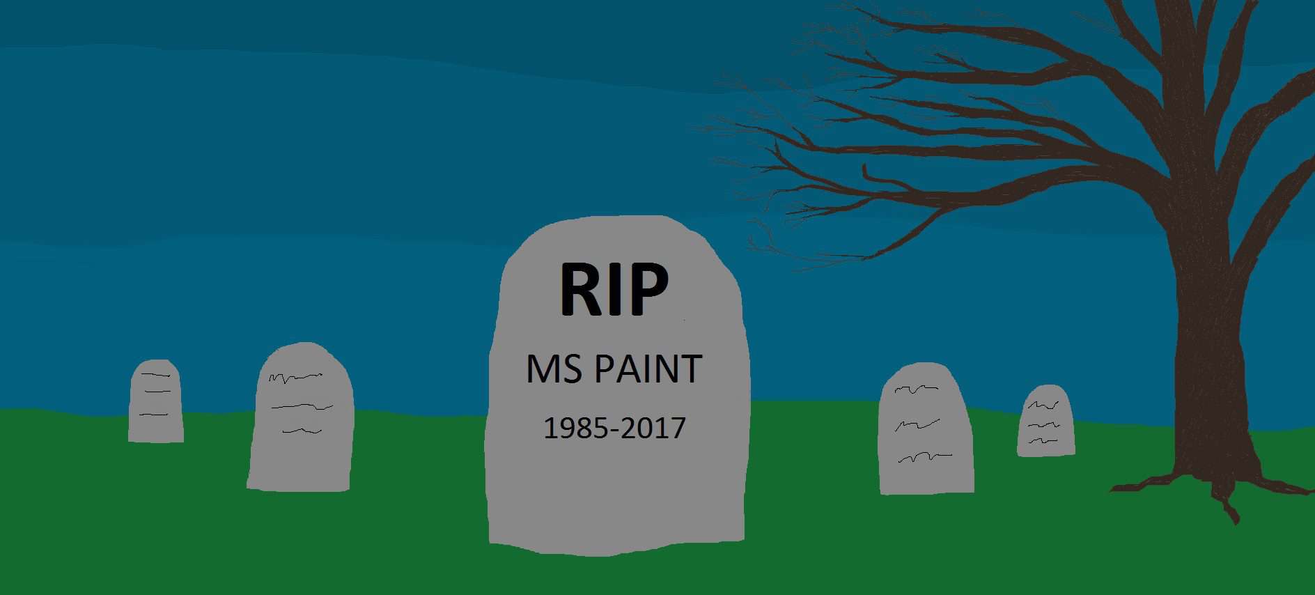
Microsoft Paint: Discontinued After 32 Years

Microsoft Paint

Today Microsoft announced the discontinuation of the Paint application in the coming Windows 10 Autumn update.

Why we are sad:

Microsoft Paint was a much-beloved pastime during the childhoods’ of our creative team. Our Graphic Designer, Marla, discovered her love of manipulating images. And creating digitally on Paint which she developed into her career. In this, she is not alone. Many of today’s digital imaging/designing specialists started out on nothing other than Paint. The end of the Paint ERA is just another nostalgic memory for many Millennials. Therefore, joining the ranks of PBS and flip phones.

A brief history of Microsoft Paint:

The legend that is Microsoft Paint began in November of 1985. With the release of Windows 1.0 under the name Paintbrush. In Windows 3.0, Microsoft redesigned the application to the format we all know and love. And shortened the name to Paint. In-depth color wells were released with the ’95 version. And allowing for images to be saved in JPEG, GIF, and PNG formatting. The Windows XP update allowed the user to import images from a camera or digital scanner. While Windows 7 featured the new art brush set. The most notable change in Windows 8 was the correction from previous versions which disabled the scroll bars when zoomed to 100%.

All is not lost:

Finally, the release of Windows 10 (Autumn) brings about the rebirth of Paint called Paint 3D. Though the name is familiar, this is not an update and will not behave like its predecessor. Therefore, it allows the user to merge 2D aspects with 3D image making tools to create interactive scenes. The capability to print on a 3D printer is one feature we are excited to see used.

To read more Killerspots blogs – click here.